We value your privacy
We use cookies to enhance your browsing experience, serve personalised content, and analyse our traffic. By clicking "Accept All", you consent to our use of cookies.
Brand Guide Preview


Brand Guidelines
Identity · Colour · Typography · Patterns
Version 2.0 · March 2026 — © 2026 Brity Group Ltd

Hello.
This is who we are. This document defines the visual language of Brity, our colours, our type, our voice.
Please use it as a reference for all communications, digital and print. If in doubt, the brand tells its own story.
Our Mission
To set and uphold a higher standard for learning.
Table of Contents
Section One — Our Identity
Section Two — Design System
Section Three — Brand Applications
Section One
Our Identity
Who we are, what we believe, and the story behind our brand. This section defines the foundation everything else is built upon.
Pages 5–7
Brity™ delivers first aid training Nationwide.
Our courses are designed to prepare people for real situations, not just compliance.
Being Brity-trained means the training meets the Brity™ Standard, with clear instruction, practical delivery, and proper responsibility.
Not a box ticked.
Not a certificate filed away.
But real confidence to act when it matters.
The Brity™ Values
Derived from the Brity™ Standard
Our Voice
Our Voice
First aid training should mean something.
Not a box ticked.
Not a certificate filed away.
But real confidence to act when it matters.
We speak with clarity and conviction.
Professional, but never cold.
Direct, but always human.
Our Identity
6
The Brity™ Values
Standards Before Scale
Quality is not sacrificed for growth.
Competence Over Compliance
Real skill matters more than paperwork.
Responsibility Cannot Be Delegated
Accountability rests with those who act.
Designed for Real Human Behaviour
Training built for how people actually respond.
Clarity Over Complexity
Simple, direct, and understood by everyone.
Integrity in Delivery
What we promise is what we deliver.
Our Identity
6
Applying the Brity™ Voice
When in doubt, default to clarity, calm, and seriousness.
"World-class training that guarantees confidence and success"
"First aid cannot guarantee outcomes, but it can improve the chances of a positive one."
"Once certified, you'll always know what to do"
"Certification does not remove responsibility. Learners are expected to act within their training and judgement."
"Leveraging best-in-class solutions to empower learning journeys"
"This course covers the skills you may need to use in an emergency."
"Simple skills anyone can master instantly"
"First aid training should prepare people for real situations, not just compliance."
"Don't worry, it's easy once you've done it a couple of times"
"If you're unsure about anything during the course, ask. Understanding matters."
"We totally understand how scary emergencies can be"
Use calm, factual language. The absence of theatrics is the standard.
Section Two
Design System
The building blocks of our visual language — colours, typography, iconography, and patterns that bring the Brity brand to life.
Pages 9–20
Our Logo
The Brity logo is our most recognisable asset. It should always be treated with care and given room to breathe.

Primary — Colour
Use on light backgrounds for all primary communications.

Primary — White
Use on dark backgrounds, photography overlays, and charcoal sections.
Logo Variants
Each variant serves a specific purpose — choose the right one for the context

Stacked — Colour
Use when horizontal space is limited
Stacked — White
Pair with dark section backgrounds
Icons and Wordmarks

All-White — Long
Photography overlays

All-White — Stacked
Watermarks & emboss
Cross — Pink
Favicons & avatars
Cross — White
Dark UI & loaders
Use wordmark only when the cross icon has already been established in context.
Logo Usage
✓ Do
Follow these rules to keep the brand consistent
✓Use on solid backgrounds with good contrast
✓Use only approved brand colours
✓Use white variant on dark backgrounds
✓Allow adequate clear space around the logo
Logo Usage
✕ Don't
Avoid these common mistakes
✗Stretch, squash, or distort the logo
✗Rotate or tilt the logo
✗Alter the logo colours
✗Place on busy or low-contrast backgrounds
Technical Reference
Logo Specifications
Clear Space
x = height of the 'B' in the wordmark
xxxxxxxxMinimum clear space equals the height of the 'B' on all sides.
Colour Reproduction
Full Colour
#FF63B1 + #202433

Black (mono)
#000000
White (mono)
#FFFFFF
Minimum Sizes
Core Colours
Our palette is warm and approachable. Pink leads — it's our signature. Charcoal anchors. The supporting palette adds versatility without competing.
Each colour family includes three shades for flexibility across backgrounds, text, and accents.
Pink (Primary Brand)
Charcoal (Secondary)
Peach (Warm Accent)
Sky Blue (Trust)
Mint Green (Success)
Coral Red (Error)
Colour Pairings
Approved combinations and usage guidelines
Hero / Primary
Warm, welcoming hero sections and category cards
Pink Light Section
Course summary, search panels, testimonials
Information / Trust
Information sections, trust badges, professional content
Dark CTA Section
Footer, CTAs, high-contrast call-to-action sections
• Use only the defined shades — no arbitrary hex values
• Opacity washes (10–20%) are acceptable for backgrounds
• Never create gradients mixing different colour families
• Maintain a minimum contrast ratio of 4.5:1 for body text
Typography
We use three typefaces, each with a clear purpose. Inter for readability. Roboto Bold for impact. Permanent Marker for personality.
Line-height standards
Body text: 1.5–1.6 · Headings: 1.2–1.3
Roboto
Display — headings and section titles only. Use Bold or Semi-Bold. Never Regular for body copy.
Inter
Primary — body text, UI, labels
Permanent Marker
Accent — short decorative callouts only. Never for body copy, instructions, or safety-critical information.
Aa Bb Cc Dd
Ee Ff Gg Hh
0123456789 !@#$%
Typography Rules
Do's and don'ts for consistent typographic treatment
✓ Do
Use Roboto Bold for headlines
And Inter for all body text and labels
Use Inter for body copy
Set at 14–16px with line-height 1.5–1.6 for readability
UPPERCASE WITH TRACKING
Use 0.15–0.3em letter-spacing for uppercase labels
Consistent heading sizes
Follow the type scale — don't mix arbitrary sizes
✕ Don't
Don't use serif fonts
Serif typefaces are not permitted.
Don't use Permanent Marker for headings
Reserved for decorative accents only
UPPERCASE WITHOUT TRACKING
Uppercase text always needs letter-spacing
Don't use decorative fonts for instructions
Decorative typefaces must never be used for instructions, warnings, or assessment content.
The Illustration Library
Five proprietary SVG assets form the decorative layer of the Brity visual identity.
Brity Cross
Core brand mark — headers and signage
First Aid Cross
Medical context — hero sections
Heart Pulse
Empathy and care — testimonials
Pulse Line
Clinical detail — section dividers
Circle Cross
Subtle depth — background texture
Usage in Context
Hero banner
Course card
Print panel
Placement Principles
Always position at edges — allow cropping off the boundary
Opacity range: 5–20% — never solid or dominant
Use only brand colours: pink, white, or charcoal
Scale freely but maintain original proportions
Illustrations are decorative accents. They must never compete with content or carry meaning.
Illustration Rules
✓ Do
Readable content here
Low opacity, edge-cropped
Content remains clear
Subtle on light backgrounds
Mix assets at varied scales
✗ Don't
Text is obscured
Never use at full opacity
Never use off-brand colours
Never use as primary content
Section Three
Brand Applications
How our brand appears in the real world — photography, video, social media, and advertising.
Pages 22–26
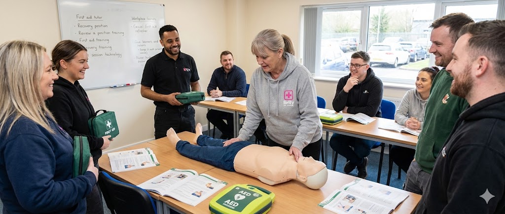
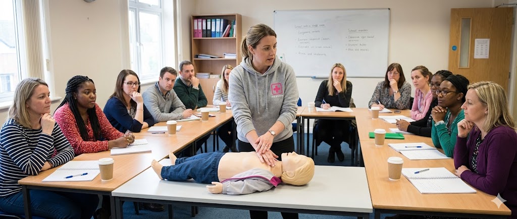
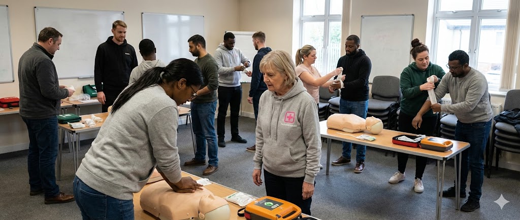
Photography Guidelines
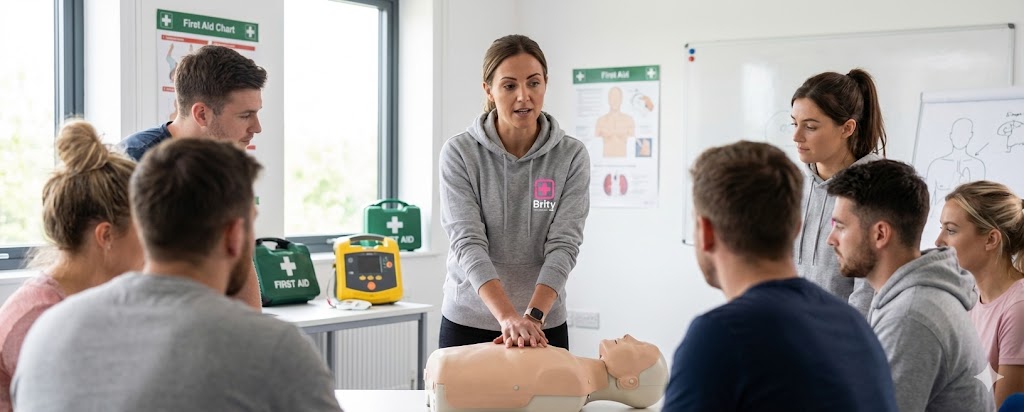
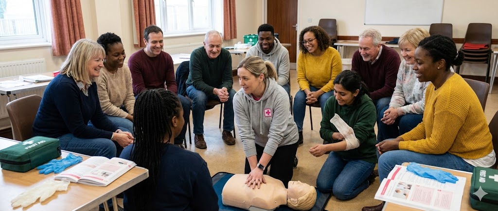
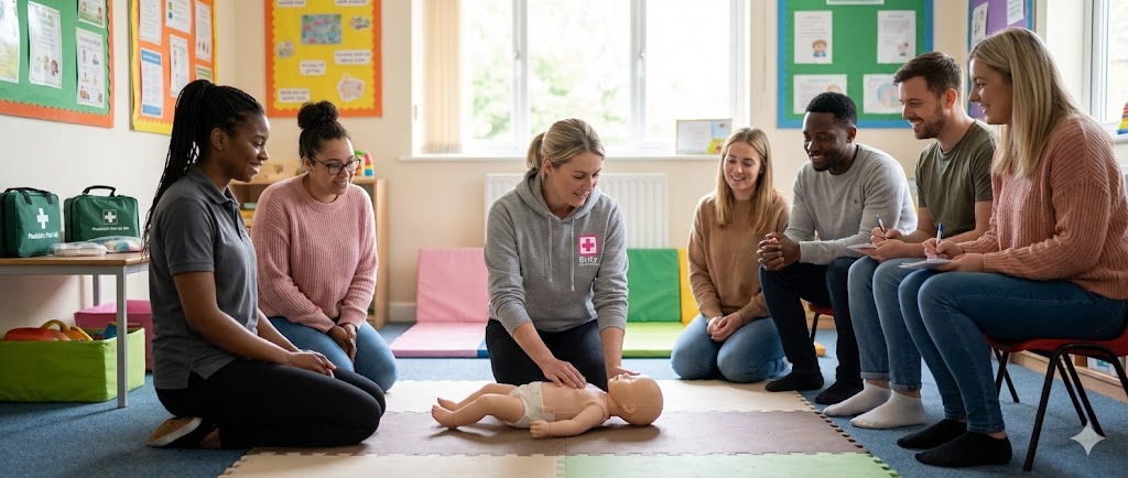
Natural lighting, active learners
Real training environment
Engaged, not posed
Style
Authentic and natural. No studio setups or artificial backdrops — images must feel genuine and unscripted.
Colour
No filters or heavy processing. Maintain the brand's natural warmth — slight white-balance correction only.
Technical
1200 px min web · 300 dpi print. Ratios: 16:9 heroes, 1:1 social, 4:5 portrait.
Headshots
Natural, relaxed portraits — no stiff corporate poses. Eye contact with a genuine expression. Consistent neutral background, soft natural light preferred.
Video
Same photographic principles apply. Natural audio, no background music over speech. Minimum 1080p, steady framing, well-lit environments. Branding subtle — lower-third logo only.
Image Usage Rules
✓ Do
High-quality, well-lit training photography
Diverse learners in real training settings
Crop to focus on engagement and action
✕ Don't
Never apply heavy colour filters
Never use blurry or poorly lit images
Never show empty spaces without people
Advert Designs
Clean compositions with clear photography alongside solid brand panels — no colour overlays on images.
Split variant · 1200 × 627
Competence Over Compliance
Regulated first aid qualifications — practised until they become instinct.
Book NowPink variant · 1080 × 1080
Emergency First Aid at Work
1-day Ofqual-regulated qualification · Open bookings
Split variant · 1200 × 627
of learners feel prepared to respond in a real emergency
Post-course data · 500+ UK employers
Facebook Post · 1200 × 630
X / Twitter
500+employers rely on Brity for accredited first aid qualifications
X / Twitter Post · 1600 × 900
Instagram Square
When a child started choking, I didn't hesitate — the training took over.
— James T., Nursery Manager
1080 × 1080
Instagram Story
1080 × 1920
LinkedIn Square
Accredited First Aid Qualifications
Regulated by Ofqual and recognised by HSE — trusted by 500+ employers.
Learn MoreLinkedIn Square · 1080 × 1080
The Brity Standard
Training should mean something.
Not a box ticked.
Not a certificate filed away.
Not something forgotten until it is too late.
Clarity over complexity.
Standards over shortcuts.
Preparedness over volume.
This is the Brity Standard.
brity.co.uk
Lifelong Learning. No Limits.
© 2026 Brity Group Limited. All rights reserved.
Brand Guidelines v2.0 · March 2026